
Blood Sugar Guides
Blood Sugar Guides
Dr David Unwin’s Sugar Infographics
We are grateful to Dr David Unwin for making his widely shared, open-access infographics available. These clear and practical posters translate the sugar content of everyday foods into teaspoons, providing a simple and powerful visual tool to support patient education and shared decision-making in the consultation room.
These resources are used with acknowledgment of Dr Unwin’s contribution and commitment to open dissemination of public health education tools.
The Sugar Burden
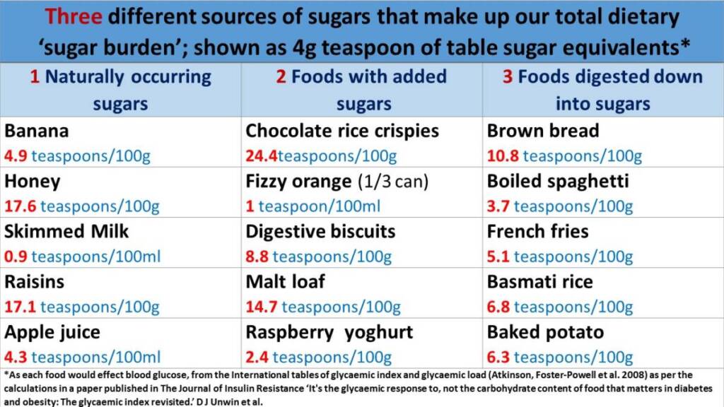
A visual summary of how much sugar is hidden in a typical weekly shop, translated into teaspoons.
Common Foods
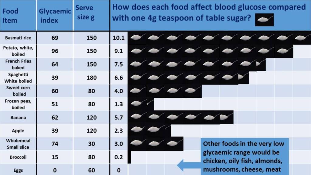
Teaspoon equivalents of sugar in familiar everyday foods — often far more than patients expect.
A Common Breakfast
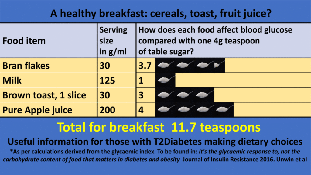
The hidden sugar load of a ‘healthy’ breakfast of cereal, juice and yogurt, visualised at a glance.
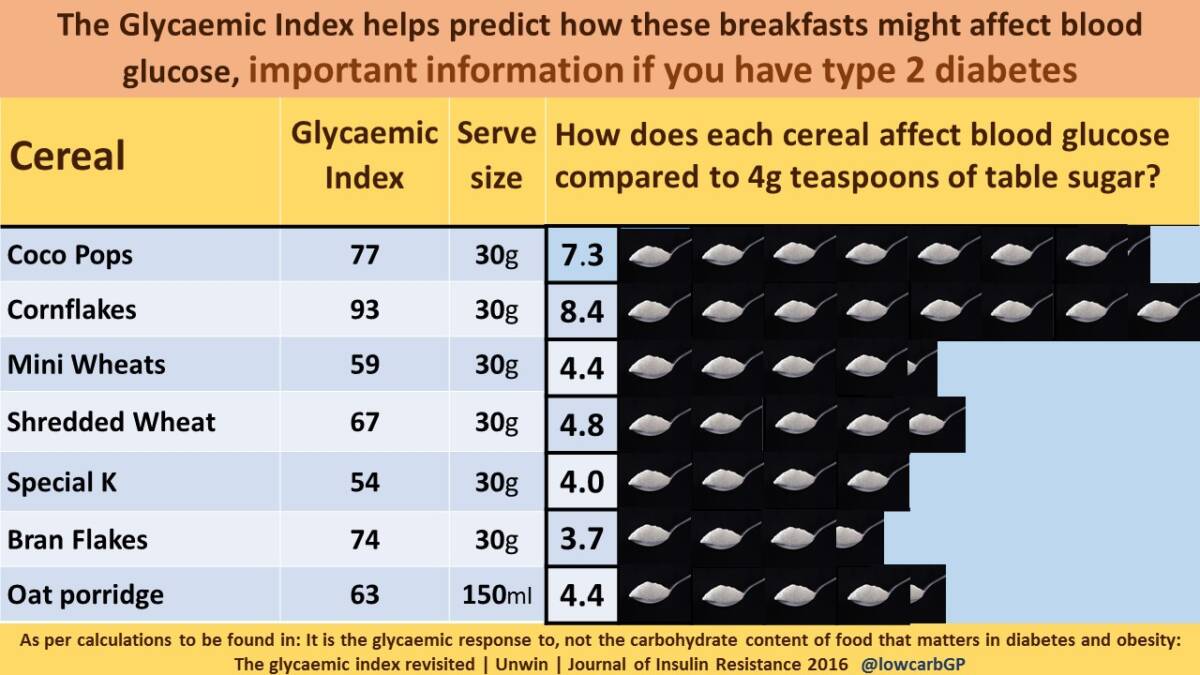
Breakfast Cereals
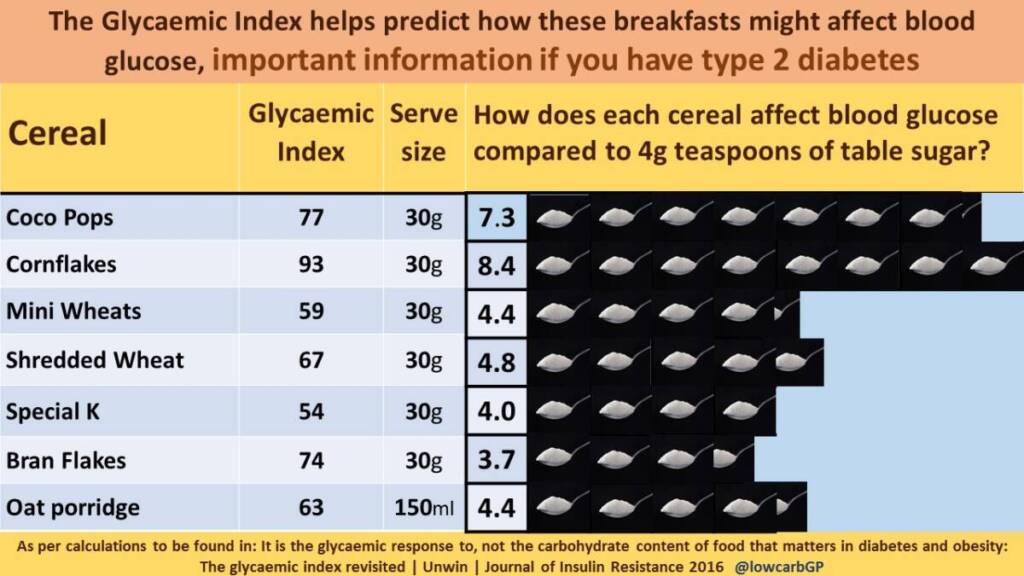
How mainstream breakfast cereals compare once you count teaspoons of sugar per bowl.
Bread
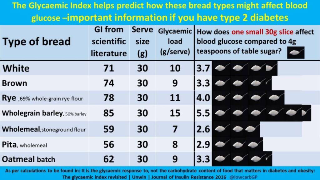
Sugar (and refined-carb) content in popular UK breads — useful alongside a low-carb consultation.
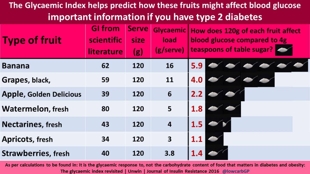
Fruits
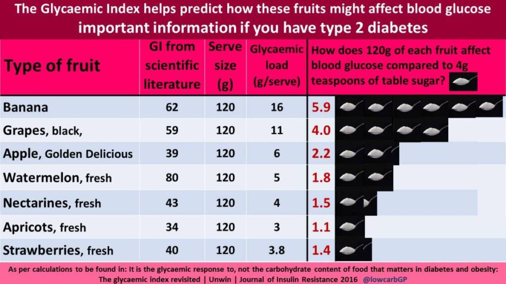
Not all fruit is created equal: sugar content across commonly-eaten fruits, shown in teaspoon equivalents.
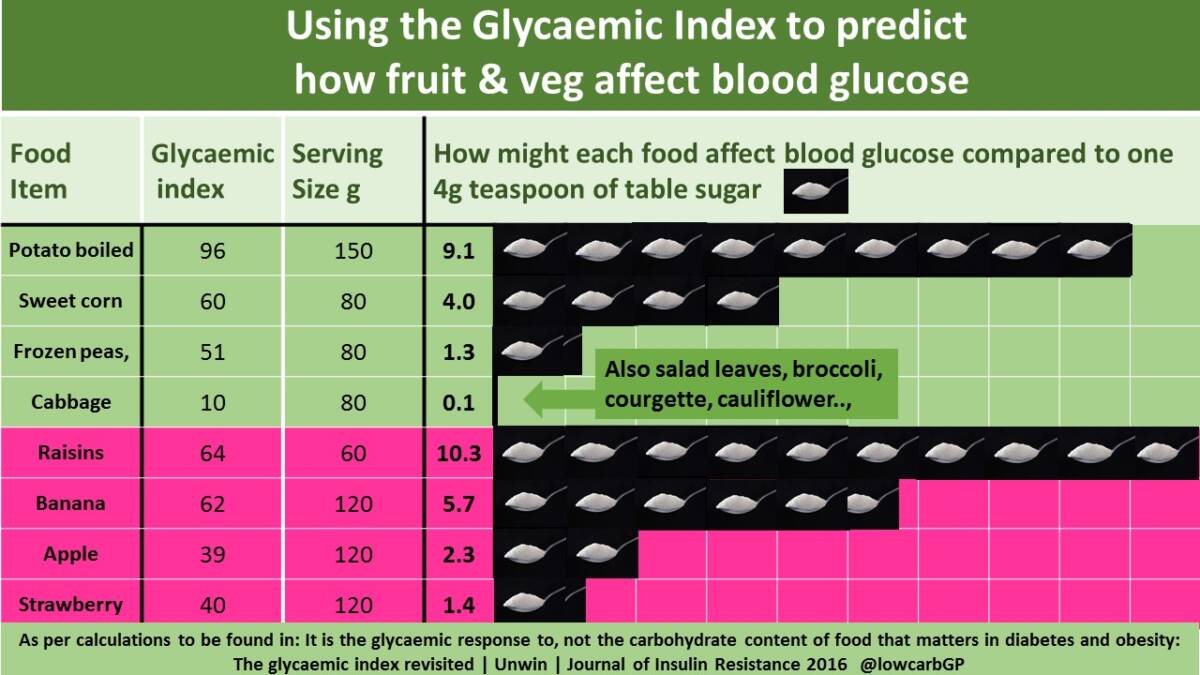
Fruits vs Vegetables
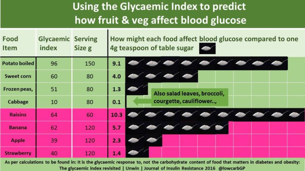
Side-by-side sugar load of fruits versus non-starchy vegetables — the case for leaning on veg.
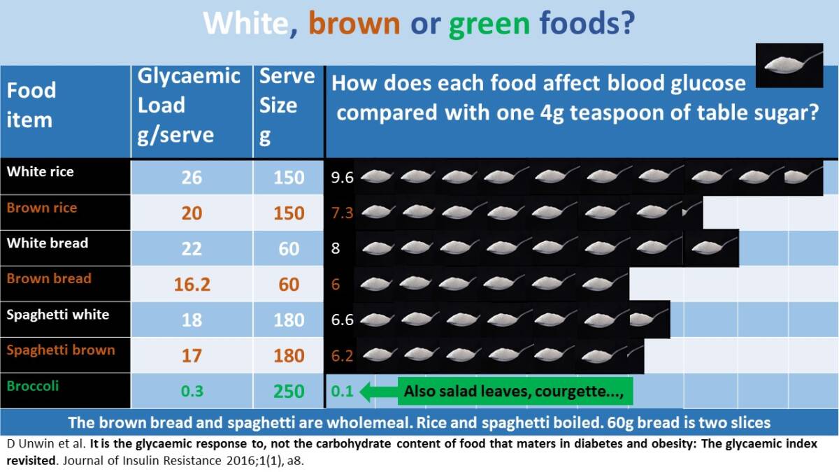
White vs Brown vs Green
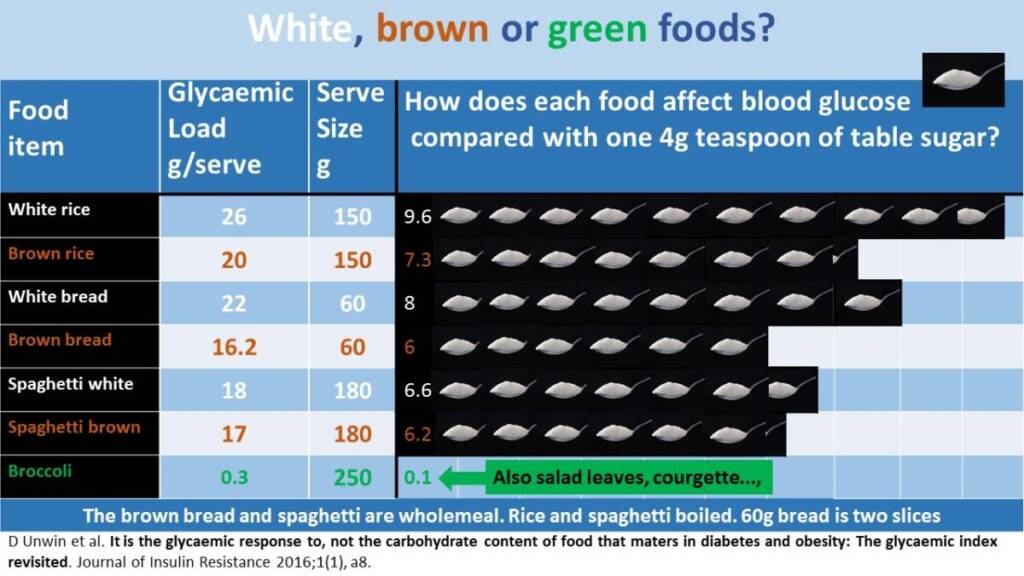
Comparing staple ‘white’, ‘brown’ and ‘green’ carb sources by sugar and glycaemic impact.
See PHC website for available translations